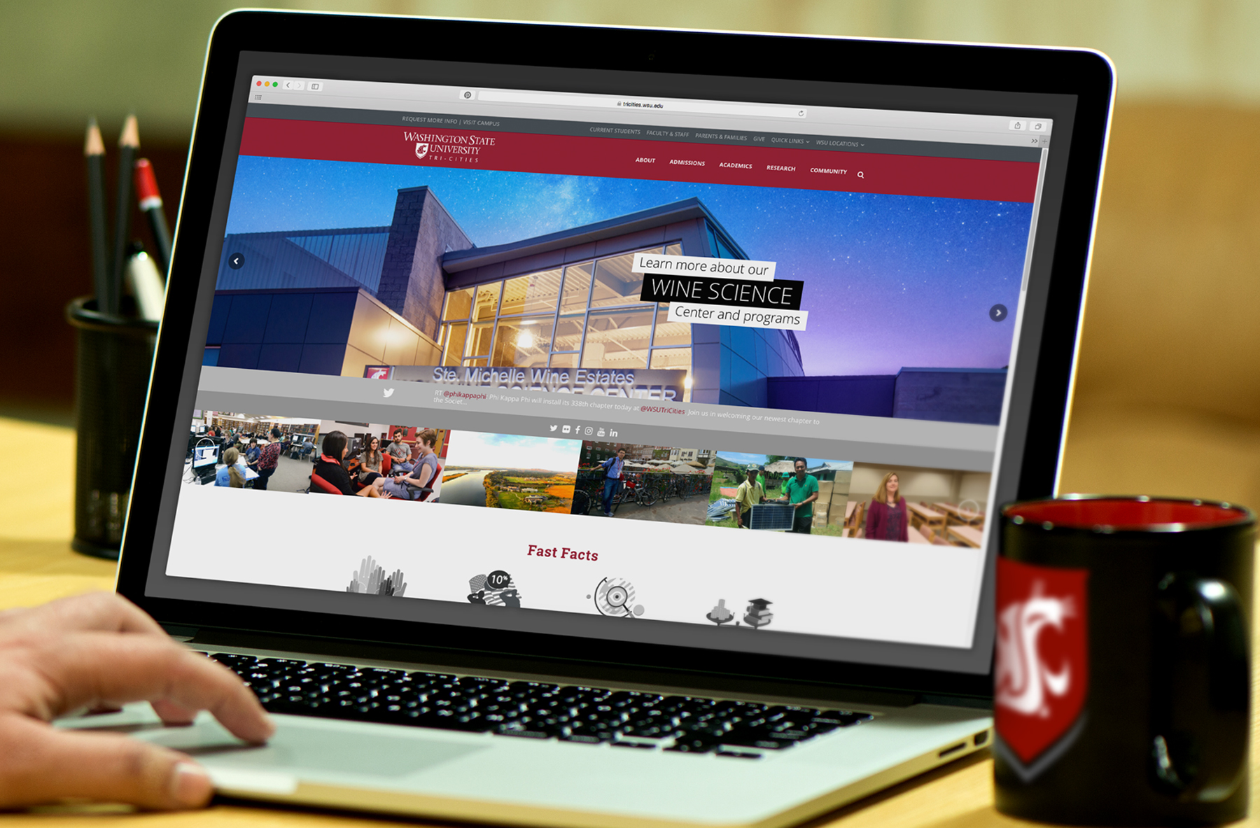
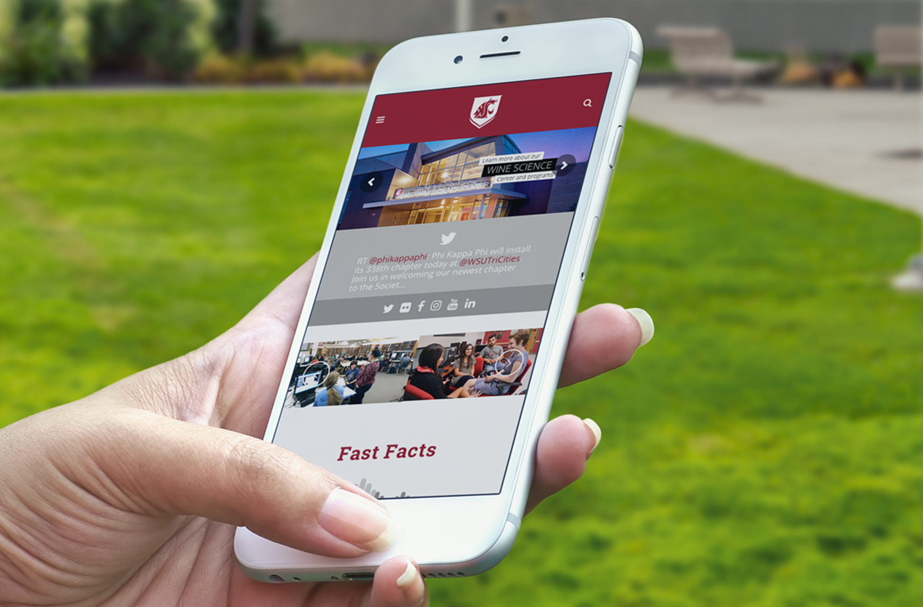
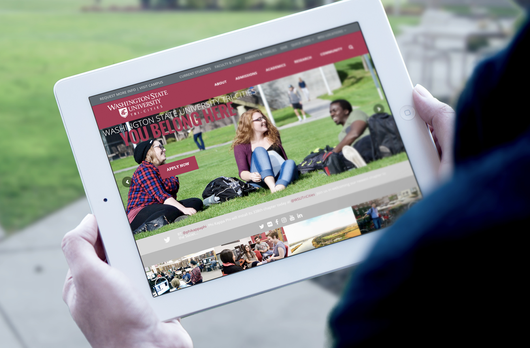
A fresh new look for WSU Tri-Cities’ website meant a great opportunity to reconsider their value proposition.
When we first sat down with Chris Meiers, Vice Chancellor for Enrollment Management & Student Services at WSU Tri-Cities, he told us that their existing “status quo” was no longer good enough for them. With tremendous growth happening at this regional branch campus of Washington State University, they needed not only a fresh new look for their website, but a complete change of tack with how they communicate.
Utilizing a comprehensive study done by a third-party agency, we set out to evaluate what was working — and what was not — with their website. We listened to not only the staff and administrators at the school, but the student body as well; we wanted to know their biggest gripes, and what they would change about the website if they were in our position.
The feedback was pretty straightforward; it ranged from “there is too much clutter on the Home page” to “I can’t find things quickly” to “I just want it to look more like the main WSU site.”
On further meetings with Chris and his team, we came to the conclusion that the site was being used to promote a lot of campus events and reminders…and what they needed was a website that does a better job at featuring their beautiful campus, filled with great case studies and personal success stories from their current and past students. In other words, they wanted prospective students to “see what they’re missing out on.”
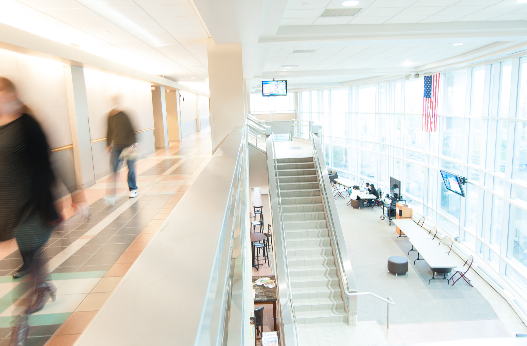
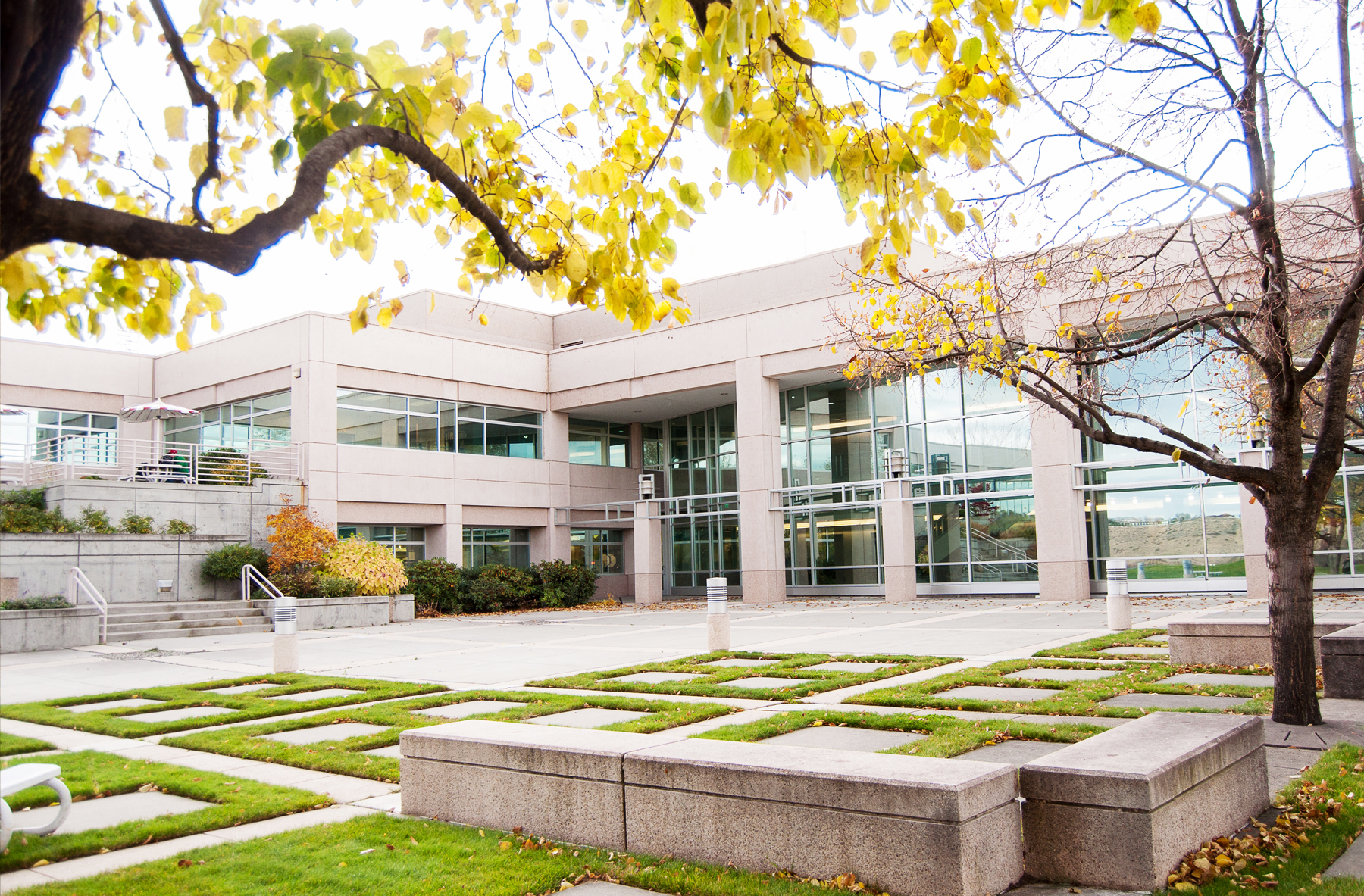
To assist in this new approach, we took many trips out to WSU Tri-Cities campus and worked with faculty and student ambassadors to capture imagery that helped paint the picture of what it’s truly like to be a student at the university. We shot photography of not only various scenic spots on campus, but also students at work in classrooms, teachers leading their classes, and the student body relaxing and doing homework and projects in common areas.
After many months of mockups, design presentation, refining, and previews, we proudly launched the new website on May 1st, 2016. The feedback since then has been overwhelming and positive; the new website is helping to increase enrollment and position the school as a top-tier choice for students from all over the Pacific Northwest.
“We went to Artmil to help completely rebrand and launch a new website for the campus. We couldn’t be more pleased with the new look and the increased engagement that we have experienced from prospective students and the community. An added bonus is that the team was a pleasure to work with from the start to the finish line!”
– Chris Meiers, WSU Tri-Cities
