
One of the most well respected companies in commercial real estate puts their trust in Artmil.
Many years ago, Robert M. Tippett came to Artmil to have a new logo done for his firm; after taking the reigns of the company from his father, Robert A. Tippett, it was clear to him that the company needed to take another look at its public-facing entities and refresh their brand. The logo was to feature a simple but sturdy oak tree, indicative of the longevity, stability, and wisdom.
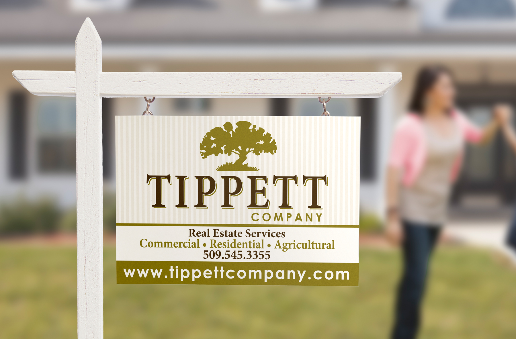
Starting with the new brand identity, Artmil then helped to create the property signs that you’ve no doubt seen around town, as well as the company’s print collateral.
In 2015, the partners at Tippett were looking to update their website and make it not only responsive, but also more appealing to the public at large. We worked with them over several months to develop a new web presence that is engaging and easy to navigate, focusing on making the look and feel simple, clear, and concise.
